Our Logo
A mark of credibility!

At Masters, more valuable than the physical assets we create are the relationships we build with our customers in their journey with us. Our logo, which depicts a ‘seal’ of our guiding principles i.e. Honesty, Integrity and Transparency, is a promise that we deliver not just Real Estate and PMC services but enable our clients to take the best of decisions and create value through their association with us
Keeping our guiding principles as a baseline for designing the logo, our Vision, Mission and Values have also been carefully woven into it to reflect in and dictate the essence of Masters.
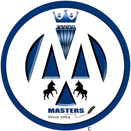
Our Logo stands for what we do and how we do as a company, cohesively. The circle signifies ‘Evolution’ at every step of our journey, which is never ending. The triangle at the base signifies ‘Integrity’- which is one of the most significant principals at Masters. The two unicorns on either side of the triangle stand for our ‘People’ working in unity and integration. The two triangles above the base triangle depicts our other two guiding principles i.e. ‘Honesty’ and ‘Transparency’, and also stand for Intelligence Quotient and Emotional Quotient (of the people), together creating an equilibrium forming a trinity depicting interdependency and working together with honesty, transparency and integration. A company with Systems and SOPs makes it complete, just like the two hemispheres atop the trinity act as shields and protection to the Teams working together.
In order to put the final product together, the teams (unicorns) following the core values (triangles) work together in harmony supported and protected by the developed systems and SOPs (hemispheres), the end result is the masterpiece, represented as ‘Diamond’ in our logo. When all the elements come together in synchronization, outcome is the appreciation and reputation earned by Masters, represented by the ‘Crown’. Finally, the name of the company in the end, followed by a feather (representing pen) signifies our journey of constant evolution that started in 2004, till eternity.
The colors in our logo are not just a mark of brand differentiation but stand for qualities that run common in Masters’ DNA. The Blue color signifies Inspiration and Sincerity, White color displays Purity and Black color stands for ‘Protection’.


